cyan
One property per card
The tint reaches the shadow as well as the overlay. Tint only one of them and the effect collapses into a coloured smudge.
Read the filescifi-ui components
A tutorial callout that points at a target, an achievement toast with a success variant and a confetti burst, a card grid where one custom property per card drives both its glow and its shadow, an icon rail, and a finale that fires when you reach the bottom. Zero dependencies, no build step, nothing loaded from a network.
On a touch screen, tap a card and it lifts. There is no hovering without a
cursor, so a tap stands in for it: whatever you tap stays lit until you tap
somewhere else, and only one thing is lit at a time. A tap on the link
inside a card still follows that link, and a tap that turns into a scroll
lights nothing. It is one mechanism for the whole set, in
hologram-tap.js, rather than a behaviour written into each
component.
One
The button below fires exactly what the product fires when someone
finishes all three daily quests in Brain Quest: a quest
toast and a rainbow confetti burst at intensity 2, together. The quest
variant is the loudest of the set, with a lit top edge and a wider outer
glow, because it marks finishing something rather than merely reporting
that something happened.
The other variants. Each announces itself through the live region, each has a real dismiss button, and each auto dismisses on a timer that pauses while a pointer is over the card, the keyboard is focused inside it, or a finger has tapped it. Hover one and watch the rail stop. Tap one and it holds until you tap elsewhere, which is the only way a finger can say that somebody is still reading.
Two
Each card sets one property, --holotint, and that single
value colours both the glow in its top corner and the shadow it pools
underneath as it lifts. Four different tints below, no modifier classes
and no extra rules. The fourth card points at an image file that does not
exist, so its image removes itself and the tinted orb shows through
rather than leaving a broken frame.
cyan
The tint reaches the shadow as well as the overlay. Tint only one of them and the effect collapses into a coloured smudge.
Read the fileviolet
Everything the pointer gets, a keyboard and a finger get too. The card lifts on focus-within, so tabbing to the link inside it does the same thing, and a tap does it on a screen with no pointer at all.
Tab to mewarm
A cool field with a single warm card in it. Two warm accents and a grid stops reading as an instrument.
Look closer
missing image
This card asks for an image that does not exist. The image hides itself, the orb behind it carries the panel, and nothing about the card looks broken.
Still fineThree
Rest, hover, focus, pressed, selected and disabled. Real buttons, inline
SVG authored here, no !important and no selectors that guess
at anyone else's markup. The third button is a toggle and reports its
state with aria-pressed, which is also what the selected
style keys off. Tab through it.
Four
The tour above steps through this page. The callout anchors to a target, flips to the opposite side when the side it was asked for does not fit, clamps itself into the viewport, then slides its beak along its own edge so it keeps pointing at the target anyway. Escape dismisses it, the left and right arrows step, and the page scrolls normally the whole time because nothing captures wheel or touch.
Measuring.
Five
Keep scrolling. When the marker at the end of this page comes into view, the confetti fires and the mascot goes up on balloons. It happens once per page load, not once per visit to the bottom, so scrolling back down will not repeat it. Reload to see it again.
The riser and the sway are two nested elements with one animation each: the outer one rises linearly for eight seconds, the inner image sways on its own three second loop. Separating them is what makes the drift look organic instead of mechanical.
Six
A stat row, the distribution behind those stats, and one line saying where the numbers came from. Every figure below is computed from the array at render time, so the panel cannot drift away from the data it describes. Point at a bar to see its bin.
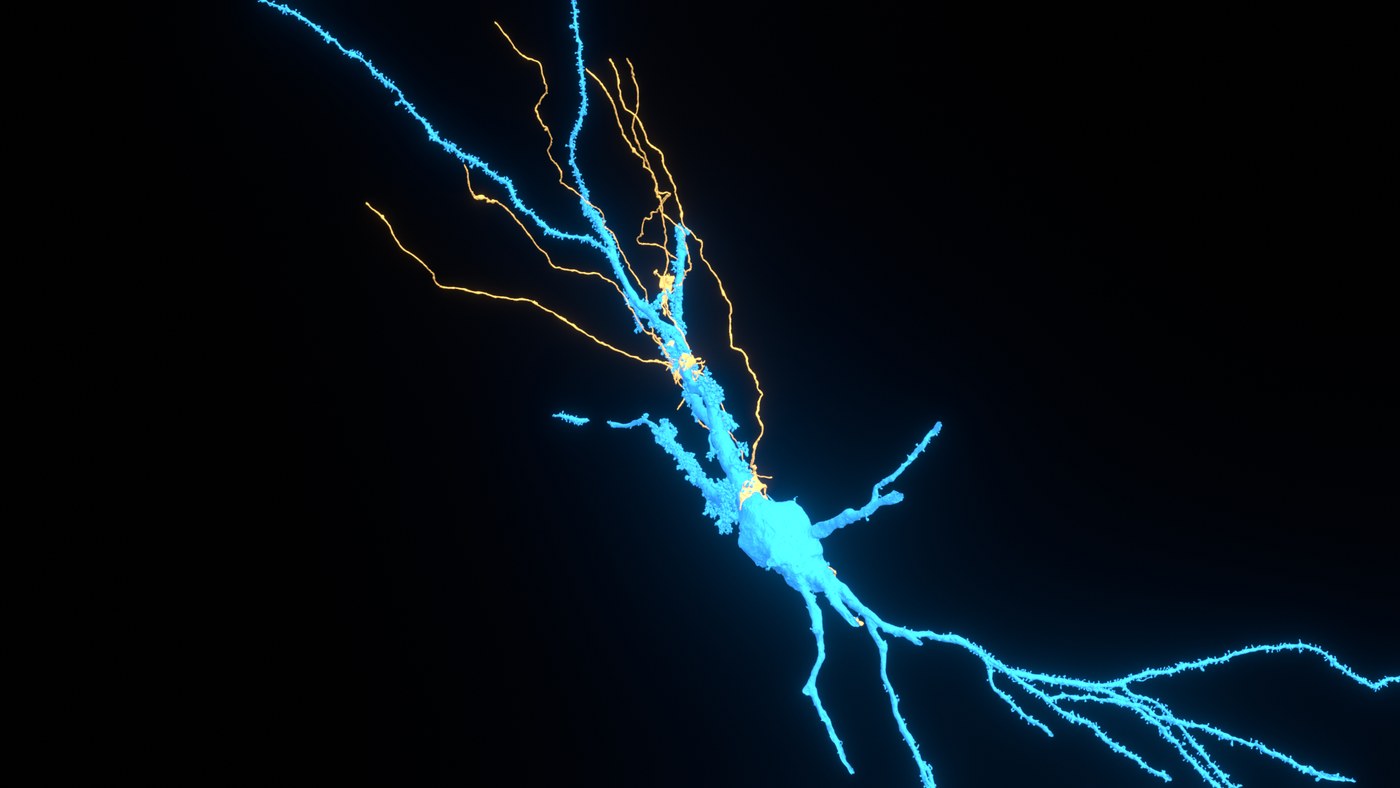
The real numbers here are the 38 proofread MICrONS cells behind the cortex page this was extracted from, coloured on that render's own depth ramp.
The reason this component is documented so heavily. A unit symbol
inside text-transform: uppercase is corrupted by the
browser: the micro sign becomes a Greek capital Mu, so
481 µm renders as 481 MM, which is a different
character and off by a thousand. It was live for weeks because MM reads
as a plausible unit. Units go in .holoreadout-u, and
holoReadout.value() puts them there for you.
Seven
Press and hold the frame below. A chip rises in the middle of it and the particles gather into the chip from the edges, so the thing you are waiting on is also the thing everything points at. Let go, or press again, to put it out. It works with a mouse, a finger or a pen, because it is bound to pointer events rather than to touch.
press and hold
They flock rather than fly straight. Each particle steers a little toward the average heading of its neighbours, pushes off any that crowd it, and is pulled toward the chip with its own strength. The arc comes from a small per particle curl added across that pull, not along it. Particles are absorbed near the chip and reborn at a random edge, so the flow is continuous instead of a single burst.
The canvas sits below the chip, deliberately. At
z-index: 5 against the chip's 6, particles pass
behind the text they are pointing at and never cross it. A converging
effect that paints over its own target is worse than no effect, because
it obscures the one thing the reader is waiting to read.
The three tints come from --holo-line,
--holo-beam and --holo-cyan at start, so a
swarm takes the palette of the page it is on. The source hardcodes its
own three, which is right for one site and wrong for a library.
Four parts, each pulled out of a site that was already using it. This callout is one of them.
This is the one Brain Quest fires when all three daily quests are done: a quest toast plus a rainbow burst. Press it after the tour.
Every card here sets a single custom property, and that value drives both its corner glow and the colour of the shadow it casts.
Above this time, and the beak has slid along the bottom edge to stay over the rail even though the panel is nowhere near centred on it.